Burrard Laptop Redesign
Turning the anxiety of buying used into confidence, through condition grading, comparison, and a rental option at the moment of decision.
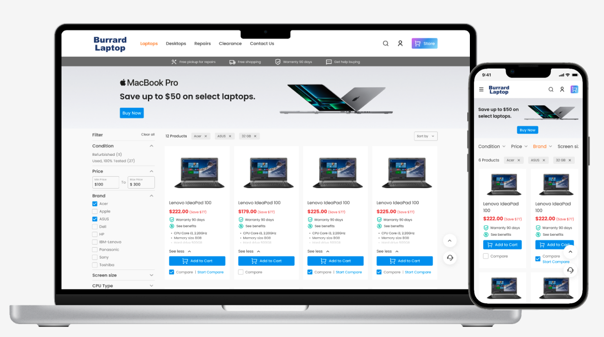
Turning the anxiety of buying used into confidence, through condition grading, comparison, and a rental option at the moment of decision.
UX/UI product designer — a one week design challenge, completed independently from problem definition to high-fidelity prototype.
Buying a used computer makes people anxious. What worries them isn't whether the page looks good. It's the machine's real condition, how long it will last, and what happens if it breaks. The original site answered none of this.
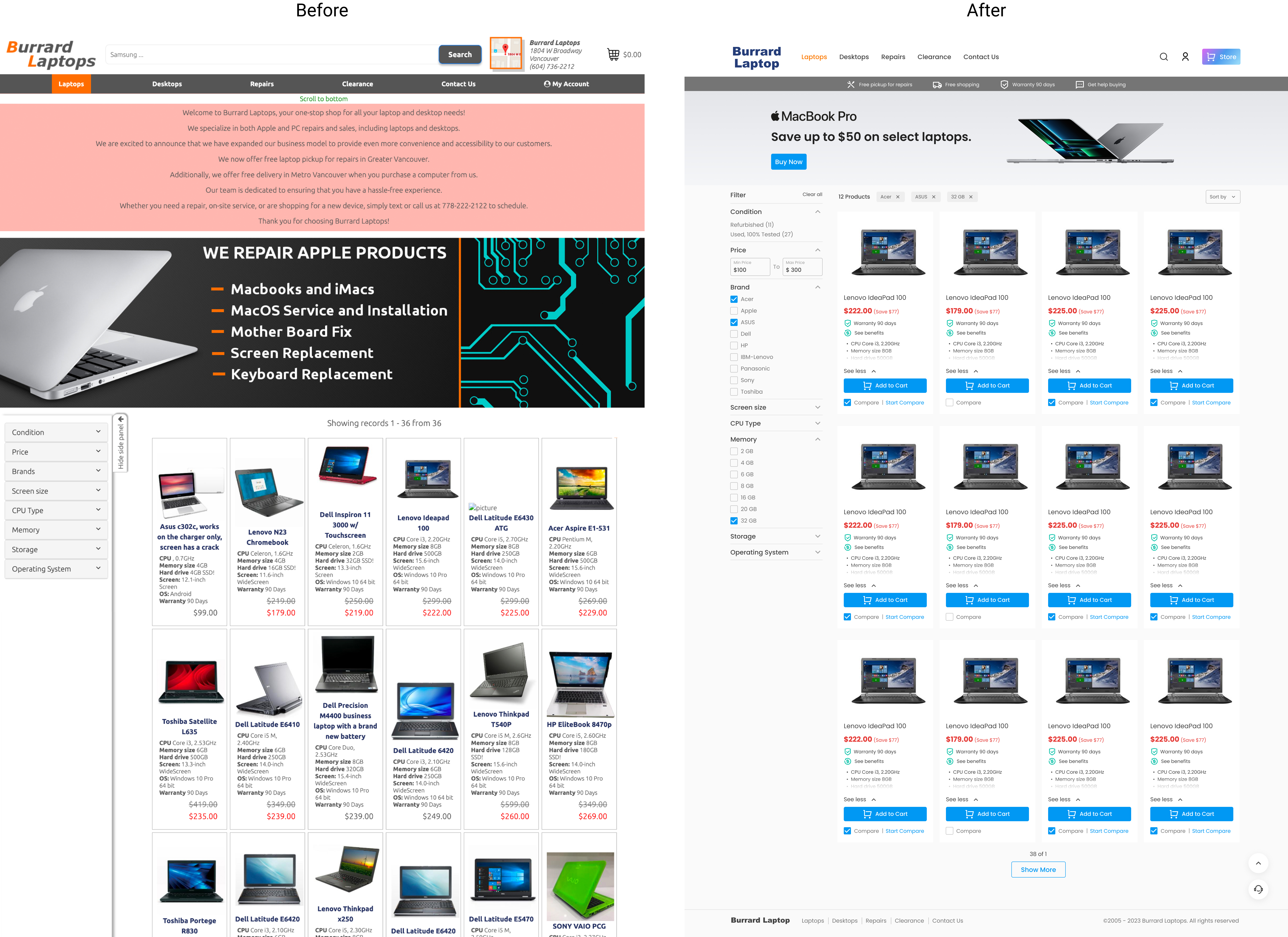
Redesign a chaotic browsing experience into a shopping flow where shoppers on a budget can easily compare, trust, and buy.
Scope focus (B2B2C)
My redesign priorities for a smooth purchase:
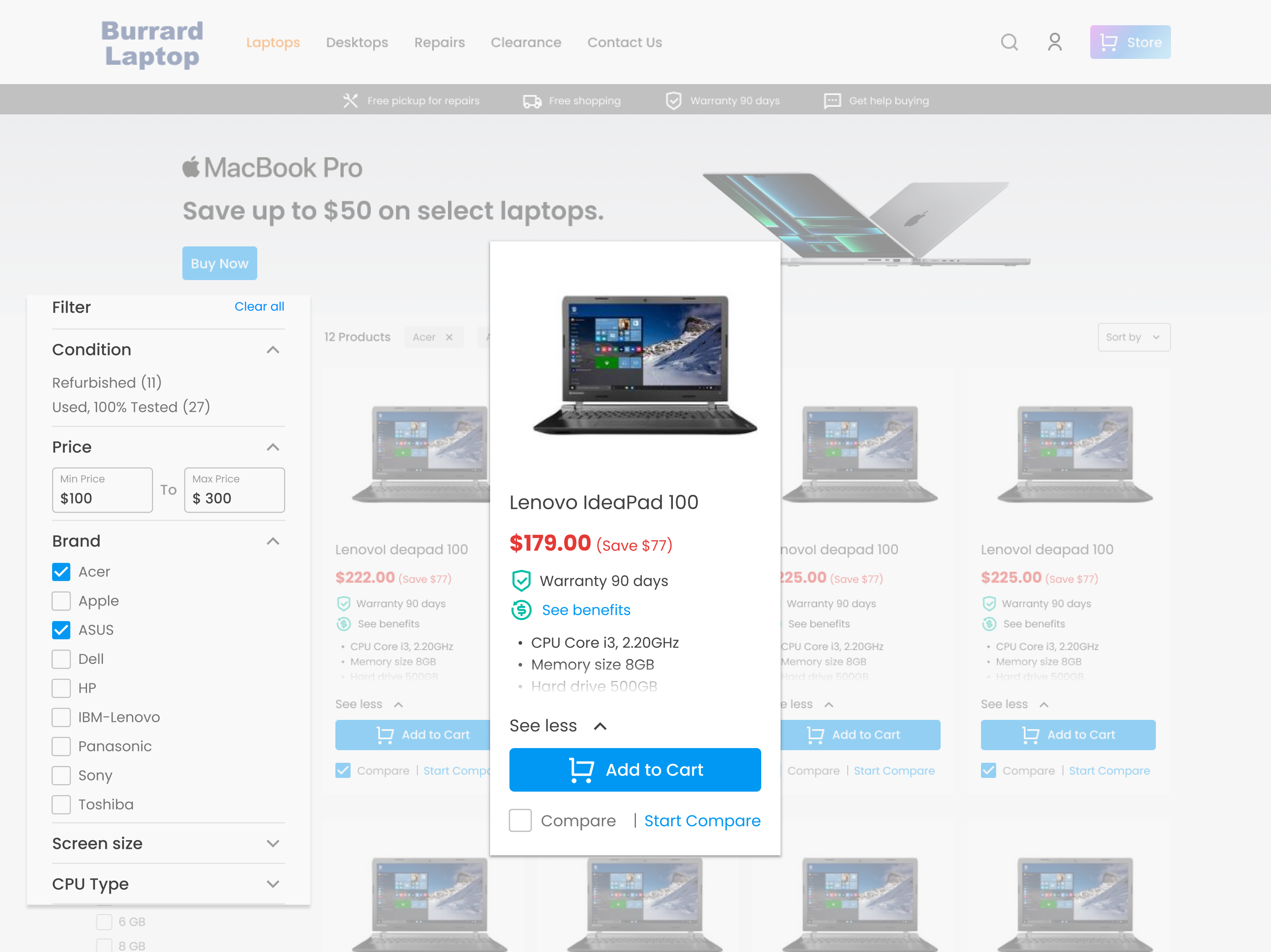
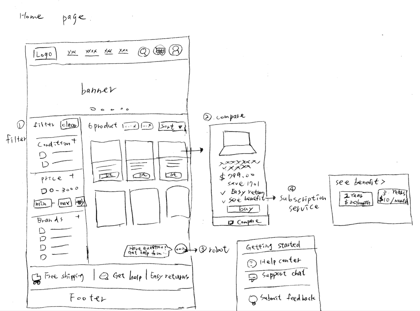
Multiple filters, side by side comparison, condition and a warranty of 90 days, all on the card.
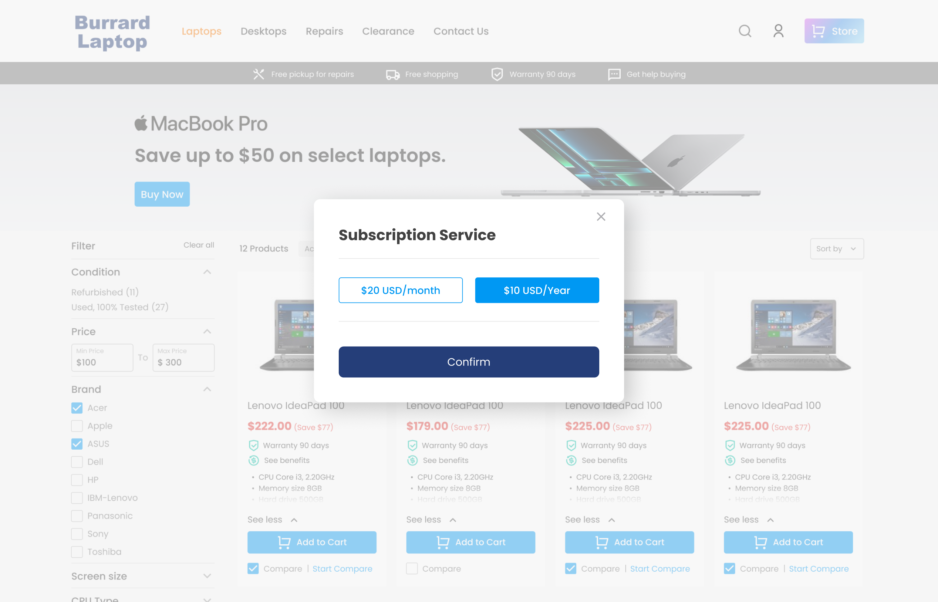
A "See benefits" entry opens a subscription concept, renting instead of buying. It stays at concept level; the full flow is a next step.
Simplified navigation, recognizable icons and clear CTAs, and a rebuilt banner that leads straight to the products.
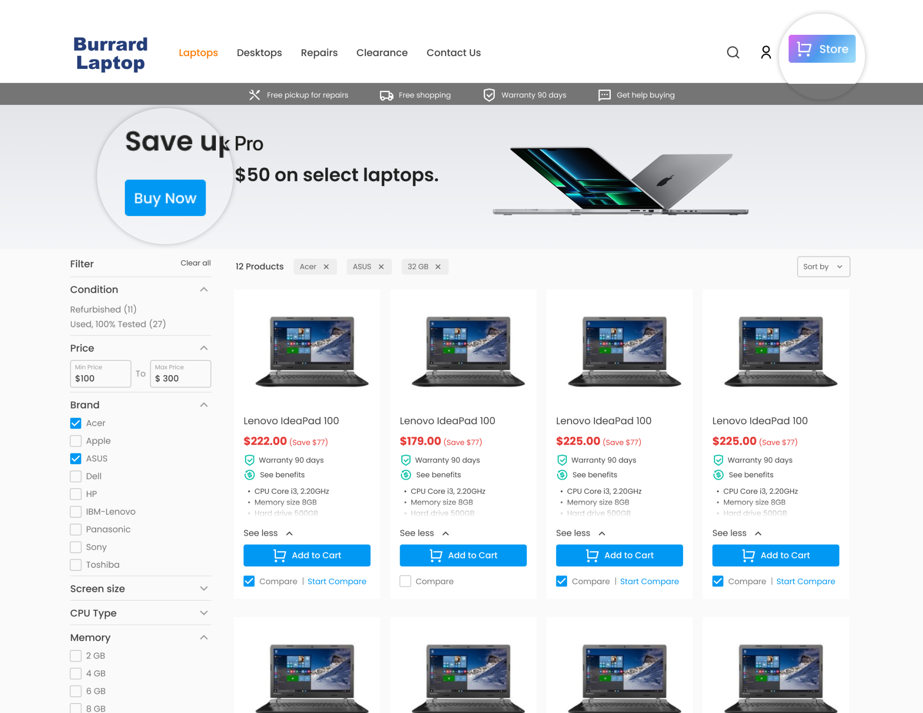
Help center, Support chat, and Submit feedback, with escalation to a real person. It cuts the time to an answer.
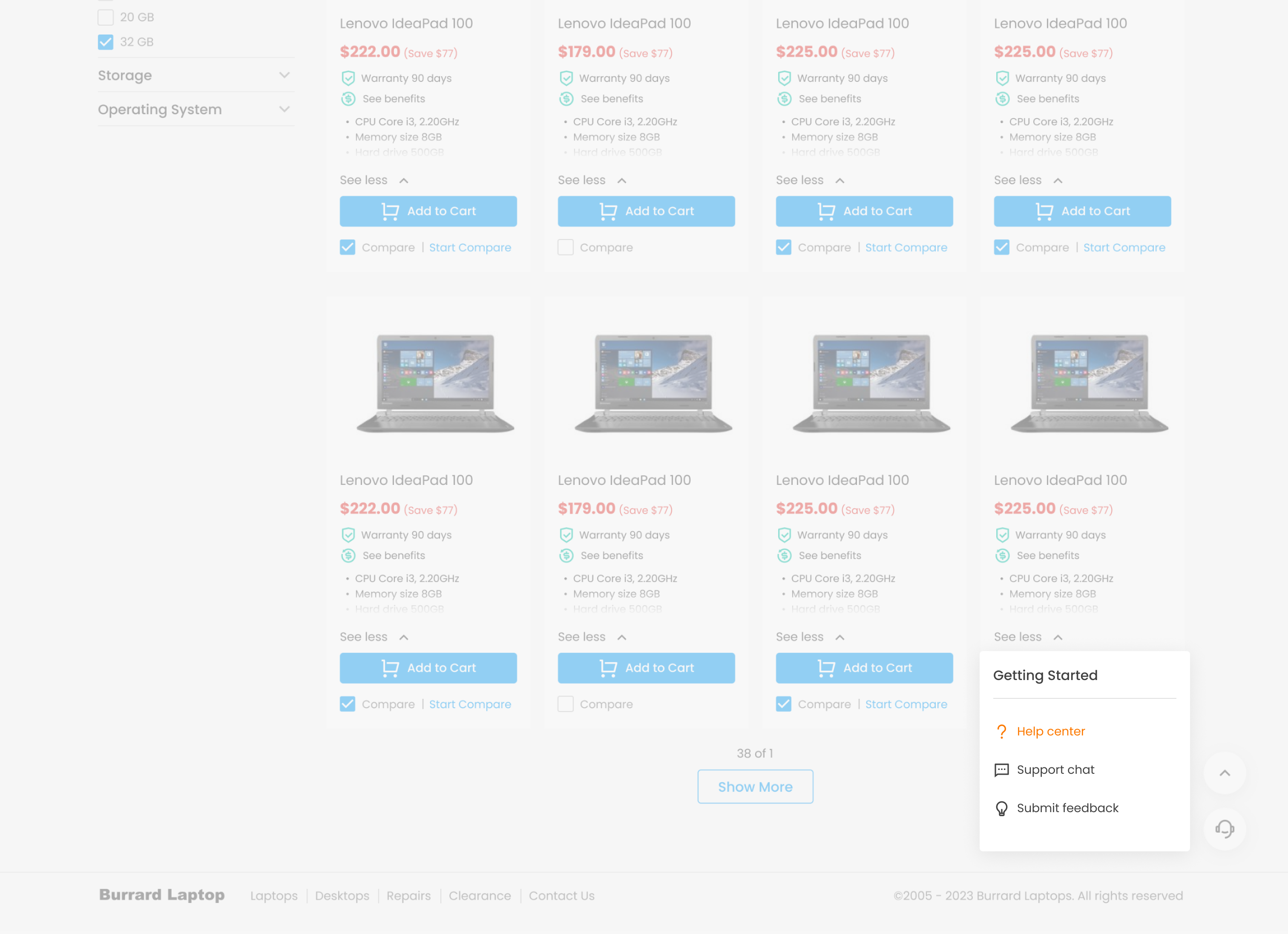
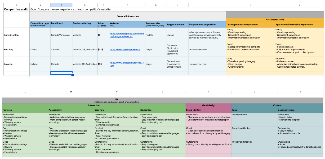
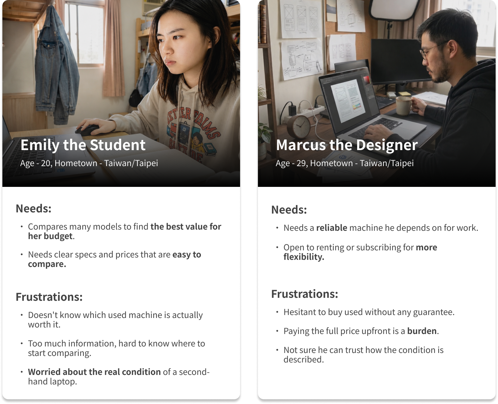
The barrier isn't price, it's uncertainty. Comparison and trust signals reduce it.
Surface condition and warranty on the card, smooth out filtering and comparison, and bring the rental service into the flow.
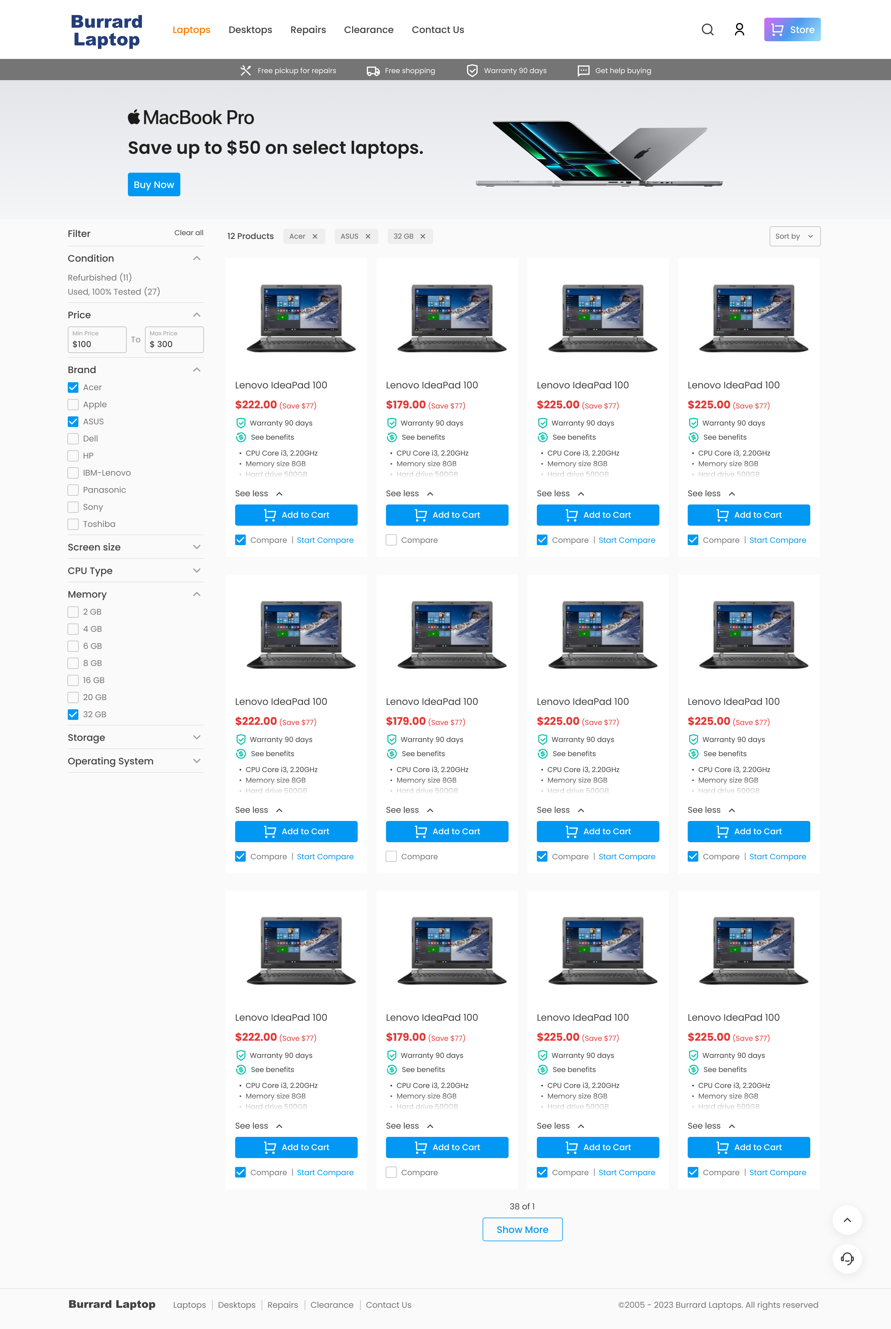
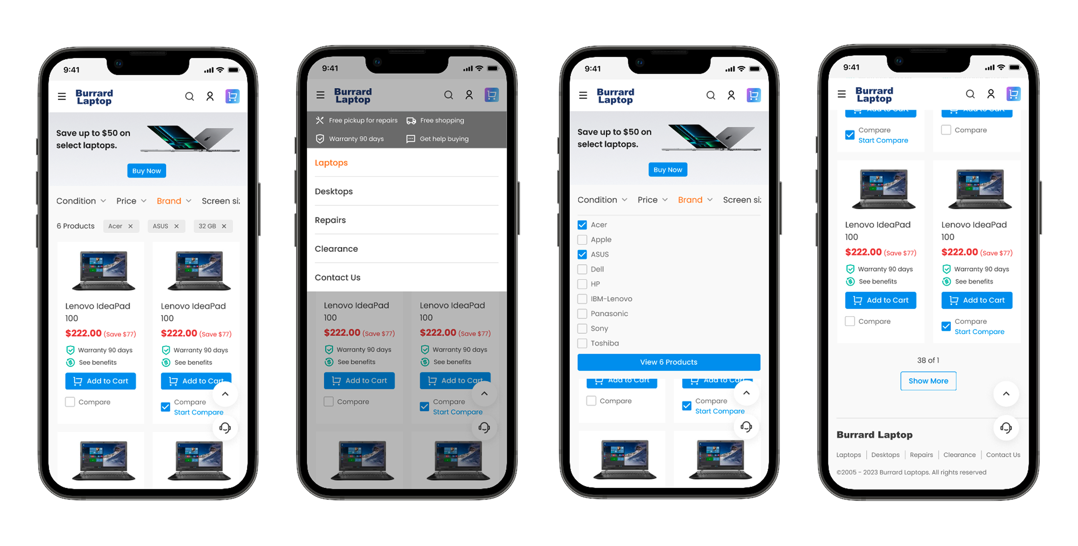
Responsive design for different devices
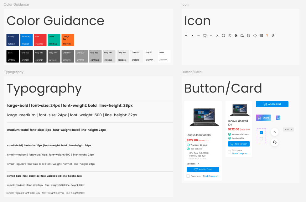
Define fonts, colours, and components in assets.
The most useful lesson was separating the symptom from the problem. The brief pointed at reading experience, but the deeper issue was buying confidence. Solving that meant designing for comparison, trust, and risk, not just a cleaner layout. I also learned that connecting a real business opportunity, the existing rental service, with a real user need, a lower barrier to entry, is where design creates value for the business.
